WHERE SUCCESSFUL ADVERTISING MEETS LGBT EQUALITY

Coors Brewing Co., New "American Gothic"

Members:

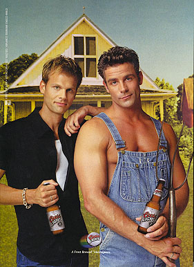
Coors, the US's third-largest brewer, rankled the Chicago Art Institute and the Visual Artists and Galleries Association for making a spoof of Grant Wood's 1930 painting.

The problem, however, allegedly wasn't with the two men, but with the beer. The museum's spokeswoman told the Chicago Tribune, "The gay issue is irrelevant to us."

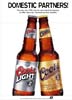
Coors has been advertising in gay publications since the 1980's, but the year 2000 marked its largest-ever outlay for gay-specific ads, said Mary Cheney, then corporate relations manager for gays and lesbians at Coors. She did not give specific figures, but said ad spending to gays alone increased 20% by the end of 2000.

Beer marketers in 1999 spent about $1.5 million advertising in national and local gay publications, according to Rivendell Marketing in New Jersey.

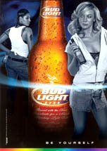
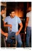
Beer companies are well represented in The Commercial Closet, largely due to an effort in the mid-1990s to pull away from the industry's longterm sexist advertising themes that objectified women. Such commercials were summed up by the Swedish Bikini Team ads from Stroh Brewing Co. for Old Milwaukee. Looking for new material to mine, brewers began extensively playing with gay and transgender themes in their advertising. However, because beer drinkers are stereotypically macho, the tone of many of the ads were more negative.

Brand
Media Outlet
Region
Agency
AdRespect Themes
User Comments
Billy
You know I get a little tired of hearing gay people whine and complain that they aren't portrayed in the media and then when we are, still bitch because of stupid reasons. There is nothing wrong with this ad. Not everything in life is a political statement. It is a beer ad for Christ's sake!!!

Thomas
This composition was poorly planned. It is a clever idea, but everything stopped there. The guys don't look like a couple, they offer little in respect to the original, and it is a cheap ad. Take the backdrop off and what is left? Nothing. The composition has nothing to it. There is no energy. Come on guys, if you have a creative bone in your body, you could have been a little more insightful. It almost hurts my feelings that by placing two hunky guys in this picture would make my love or even drink Coors beer. Don't go messing with an icon unless you have some creative things going on that enhance on the original. In 10 years what will we think? BORING attempt.

Ken
What was great in Wood's painting is absent here. What is particularly offensive is the general misconception that one of the partners in a gay relationship assumes the female role. Hence, the gentlemen on the left is showed somewhat limp wristed with an oversized bracelet. Two attractive men doesn't make it real. If you don't understand your market niche, you can't sell to it.